Five Things That Make a Renovation Feel Cheap (That Have Nothing to Do with Budget)
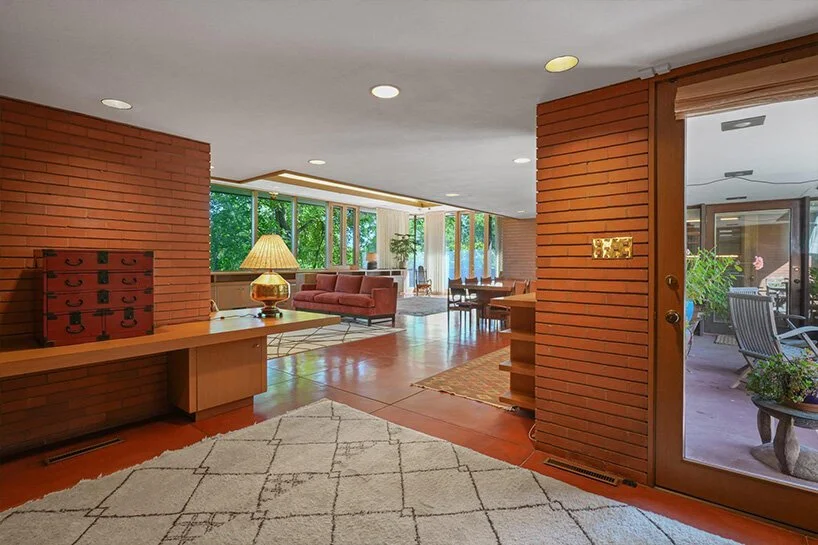
Keland House, Frank Lloyd Wright
In the late 1930s, Frank Lloyd Wright set out to design homes for ordinary American families — teachers, writers, engineers — who wanted to live well but couldn't afford the houses he was known for.
He called them Usonian houses. They were built with simple materials: concrete slab floors, wood boards, brick. No basements. No attics. No expensive finishes. The budgets were tight by design.
Decades later, those houses are considered masterworks. People travel to see them. Families who live in them describe them as the best spaces they have ever inhabited.
The mid-century modernists who followed — Neutra, Eames, Buff and Hensman — made the same argument with the Case Study Houses. Modest materials. Extraordinary spaces. The quality was never in the budget. It was in the decisions.
That lesson is as relevant today as it was then. You can spend a significant amount on a renovation and still have it feel off. And the reason almost always comes down to one of these five things.
1. Proportion
Wright was obsessive about proportion — the relationship between the size of a room and the height of its ceiling, the width of its doors, the scale of its openings. He understood that when these relationships are right, you don't notice them. You simply feel at ease.
When they are wrong, the room feels off and you cannot explain why. A common renovation mistake is opening up a space — removing walls, enlarging a living area — while keeping standard-height doors and windows in place. The room grows but the openings don't, and suddenly everything feels mismatched.
Proportion is established in the design phase. No finish can correct it afterward.
2. Ceiling Height
The Usonian houses had deliberately varied ceiling heights — low and intimate in the private spaces, higher and open in the living areas. This compression and release was not accidental. It was one of Wright's primary tools for making modest square footage feel generous.
The standard eight-foot ceiling became standard for cost reasons, not design ones. In a living area that has been opened up, it can make the whole space feel like a basement regardless of how much light comes in.
Raising a ceiling — even partially, even in one zone — changes how a room breathes. It is almost always worth pursuing when a renovation is already opening walls.
3. Window Placement
Mid-century modernists treated windows not as holes in walls but as the primary connection between inside and outside. Where a window sat, how high its sill was, whether it captured the garden or the sky or the tree line — these were design decisions, not contractor defaults.
A common renovation error is keeping existing window openings in place when rooms are being reconfigured. The result is windows that sit at the wrong height, face the wrong direction, or fight the new layout instead of completing it.
Well-placed windows make a modest room feel considered. Poorly placed windows make an expensive room feel unsettled — and no window treatment will fix it.
4. Material Transitions
The Usonian houses used inexpensive materials — but every transition between them was resolved. Where the concrete floor met the brick wall. Where the wood ceiling met the clerestory glass. These moments were designed, not discovered on site.
In renovations today, unresolved transitions are one of the most reliable signals of a project that skipped the design phase. Tile meeting hardwood in the middle of a threshold. Trim that changes profile between rooms. Countertops that end without a clear edge condition.
These details read as cheap regardless of what the individual materials cost. Resolving them requires decisions made before construction begins — about how every surface will meet every other surface.
5. Lighting
Wright used light the way a painter uses shadow — as deliberately as brightness, to define form and create depth. The Usonian houses had clerestory windows, corner glazing, and carefully positioned openings that moved light through the space across the day. None of it was expensive. All of it was intentional.
The most common lighting mistake in renovations today is a grid of recessed lights centered on the ceiling with no other source. It is functional. It is also flat and institutional — it erases depth from a room the way overhead fluorescents do in an office.
Rooms that feel expensive have layered light at different heights — ambient, task, and accent working together. This is not about buying better fixtures. It is about deciding where the light goes before the electrician shows up.
Why most builders get all five wrong
Wright obsessed over these decisions because he had to — every dollar had to earn its place. Today, most developers and production builders operate under a completely different set of priorities. The result is homes and renovations that feel generic at best and cheap at worst, regardless of the price tag.
Here is why it keeps happening:
Speed over craft. Production schedules are built around minimizing time on site. Decisions that require thinking — proportion, transitions, lighting layout — slow things down. Defaults are faster.
Catalog thinking. Most builders work from a fixed menu of standard components — stock door heights, standard window sizes, default ceiling heights. Anything outside the catalog costs more and requires coordination they are not set up to provide.
Margin pressure. Every upgrade — a taller door, a relocated window, a varied ceiling plane — adds cost that compresses profit. The path of least resistance is to keep everything standard and spend the budget on visible finishes that photograph well and sell quickly.
No design phase. Most contractors and developers do not involve a designer before construction begins. Decisions about proportion, light, and material transitions are made in the field by people whose job is to build efficiently — not to think spatially.
Finishes as a distraction. High-end tile, quartz countertops, and brushed nickel hardware are easy to sell and easy to photograph. They become a substitute for the spatial decisions that actually determine how a home feels to live in — and by the time the homeowner realizes the finishes didn't fix the problem, the walls are already closed.
This is not a criticism of contractors — it is a description of how the industry is structured. Builders build. Designers think. The problem is that too many renovations today skip the thinking entirely and go straight to building.
Modern residential design exists precisely to solve this. A designer engaged before construction starts ensures that proportion, ceiling height, window placement, material transitions, and lighting are all resolved on paper — where changes cost nothing — rather than discovered on site, where they cost everything.
The lesson Wright already taught us
None of these five things are selected at a showroom. None of them appear on a contractor's estimate. All of them are decided — or missed — in the design phase, before a single wall comes down.
These decisions are not made on the job site. They are made in the conversation before construction starts — and that is where bad renovations are prevented and good ones become great.
At RT Studio we work with homeowners in the DMV who want to renovate with intention — not just update their finishes and hope the space feels right. Wright proved nearly a century ago that a modest budget and the right design decisions produce spaces that feel extraordinary. The inverse is also true: the wrong decisions, made without a designer involved, produce spaces that feel off no matter what was spent.
If you are planning a project and want to make sure these decisions are made correctly from the start, we would like to talk.